Tuesday, April 27, 2010

DESIGNING WOMEN


The recent passing of actress Dixie Carter reminded me how much I loved her TV show (if you have to ask which show, you aren’t reading this blog). Those Sugarbaker sisters and their loopy cohorts may not have been great modernist designers, but they sure were fun. And there wasn’t too much in the way of “design television” in the days before HGTV.

SO… here is salute to Designing Women—not the show, but ten actual women who make the world beautiful for a living. Besides their talent, they have two things in common. They all had their work published in METROPOLITAN HOME while I worked there, and they all have web sites, so you can just click on their names to see oh, so much more. I mean, really: embarrassment of riches. I couldn’t choose. I did choose, but it wasn’t easy.

So before we get to the ladies of today, here’s a designing woman from the past: It’s Dorothy Draper. If you don’t know who she is, go directly to Google. Do not pass GO, etc. Your design education is hanging in the balance.

So, we begin…

NISI BERRYMAN is the proprietor of the forward-looking NIBA Home, one of the great design shops in Miami. Her own home is small in size but, like Nisi, huge in personality thanks to her passion for pink and the all the fruity colors of the tropical market rainbow. I love the living room (it’s one of my favorite colors) and the contrast with the dining room in the back—is it a chocolaty plum, would you say, or espresso aubergine? That feathery “chandelier” is from ABYU a.k.a. And Bob’s Your Uncle.


What a difference a client makes! BETSY BURNHAM’s project for MET HOME was a fairly masculine, Asian-infused home for a single man living in one of the upmarket neighborhoods of Los Angeles. It was polished, subtle, quiet and altogether inviting. So look what else Betsy can get herself up to: Color on color on color, multiple patterns, a chromatic whirlwind. It takes enormous talent to throw this many high-octane fabrics and finishes at one room and not have it look like the pasha’s attic. I’m pretty conservative about color, but I love this home office. Not for me, but for someone I like... a lot.


TORI GOLUB was a fashion stylist before she turned her considerable talents to interior design. Her Manhattan-based residential firm has attracted a long list of devotees thanks to her “comfort modern” aesthetic. The bedroom here, in the Hamptons, has sweet dreams written all over it—and not too many pillows (the homeowner is a single man). If you think the bedroom is great, what about the bathroom that goes with it? Bottom line: I want it!!! That sculptural circle thing is an antique child’s hoop and stick.


LORI GRAHAM’s work appeared in MET HOME more than once, thanks to the Washington, D.C. designer’s broad range and considerable mastery of her medium. The pearly bathroom is from a home in the capital’s Kalorama neighborhood. Every single piece is perfect, and the juxtapositions are inspiring. The bedroom is from a different place, a condo in TriBeCa, New York CIty, which is just a mile or two south of my own apartment, so moving it up here wouldn’t be too difficult, now would it, Lori? Maybe you should ship the bathroom up from D.C., too.


Sometimes you just get lucky with clients. JUDY MALE, who is half of the Male-Cahlin partnership, found art collectors with an enormous penthouse duplex overlooking the water and, let's face it, a bank account to make their Miami dreams come true. Male made all the right moves to show off the Midwestern couple's museum-quality art and to pair it with furniture of comparable provenance. Still, the place functions well for entertaining and as a family home. While all the rooms have drama, they also embrace man’s… and woman’s… need for comfort.


I first heard of KARA MANN, interior designer and showroom owner, when MET HOME ran pictures of her own extraordinary apartment in Chicago (which also appeared in GLAMOUR: MAKING IT MODERN). I loved her high contrast, dramatic world of whites and dark, dark browns with its Goth details. I liked the next place of hers I saw, too, a renovated and expanded Victorian with this monochromatic dark-grey living room alive with subtle metallic accents and Asian resonances. It's unexpected and altogether winning. Plus there's one of those Chinese warriors in the corner. I love that! It makes me want to go back to China.


VALERIE PASQUIOU made her MET HOME debut with the L.A. canyon home she designed for singer k.d. lang (it used to be a “retreat” for movie star Rock Hudson). The place was comfortable, natural, and highly meditative, a fresh twist on Zen, with lots of Japanese details and floaty fabrics. So imagine my surprise when the next Pasquiou project I saw was this incredibly sophisticated wide-open loft in New York City. Valerie, who is French and has offices in Paris as well as New York, obviously has a lot of Gallic versatility up her sleeve. UPDATE: Valerie's latest project, a loft in the East Village of Manhattan was published in the New York Times Home section on April 29, 2010!

“RAJI” RADHAKRISHNAN of Washington, D.C. (principal of Raji RM & Associates) is a quirky, eccentric, eclectic designer with a great eye for the unexpected. She gracefully manages to balance the grand gesture and absolute refinement, which is no mean feat. One of the things she does that speaks to my photo-heart is to turn scale on its ear with enormous photo enlargements of details from works of art, as in this living room just outside the capital district.


JILL VanTOSH is the municipal equivalent of a “national treasure” in the city of Atlanta. This dining room, which ran not only in MET HOME, but also on the cover of GLAMOUR: MAKING IT MODERN, is one of my favorite rooms ever. It’s not exactly “my style,” but it’s amazing enough for me to consider changing styles. For those of you who like white on white (and variations of the themes), Jill is a master of the ultra-pale. She has a broad range, and her rooms are deeply layered and meticulously detailed. Is it wrong to fall in love with a shade of blue? It's not. Right?


One of my favorite locations in MET HOME was a radically pure white home that TOBY ZACK of Ft. Lauderdale, Florida, designed for clients in Palm Beach. Every single living room textile was the exact same shade of white, and they all matched the walls, ceiling, and floor. The only color came from the art—vibrantly primary and modern. The room was visually compelling and not the least bit cold. So I was delighted in doodling around the web to find this gleaming kitchen, which is not just hot, it’s smokin’—and super cool, too. If you like Italianate sleek, this will put you over the moon!


Good stuff. It makes me happy. But before I close, here is one last picture.


That, of course, is Mame Dennis, as portrayed by Rosalind Russell in Auntie Mame, the designing woman of my childhood. Got a problem? Feeling down? Then just... redecorate!!!! Everything I ever learned about interior design begins with her!—ML


Monday, April 19, 2010

IT'S A CONRAN WORLD

In honor of today's opening of the New York City Conran Shop in it's new location—at ABC Carpet & Home, the epicenter of design in Manhattan, at least at the retail level—I have decided to offer a salute to Sir Terence, who set up his first design business in 1956 and has been charging like the Light Brigade ever since. With three of his four adult children following in his footsteps, you might well say he is as dynastic as he is dynamic. (The portrait of Old Smokey was taken by Dara Flynn for The Sunday Times of London in December 2009).

I first met his Designship at his duplex atop the company's offices on Shad Thames (that's a street on the formerly unfashionable south side of the river, east of the Tower Bridge). Once upon a sailing-schooner time, this was a thriving commercial area for trade in tea, coffee, and spices, but by the mid-1990s the magnificent red-brick warehouses, with their impressive above-the-street gantries, were empty and the cobbled streets abandoned. Here it is back in its first prime:


By the time Sir Terry and his fellow investors got hold if it, "Butler's Wharf" wasn't used much, except as a location for films that were set in (a) a scary place or (b) a historic place or (c) both of the above—films (and TV shows) like Dr. Who, The Elephant Man, The French Lieutenant's Woman, and, of course, Oliver! Dickens lived not far away in his salad days (although he probably didn't eat much salad).

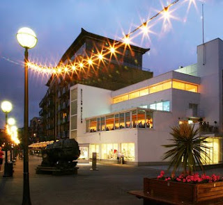
Now the area is chic rather than cheap or cheeky. It's full of cafés and restaurants, high-end lofts, and the Design Museum, founded—you should not be surprised to learn—by Conran and a few like-minded artful dodgers in 1989. And here it is now, in a lovely evening photo by Luke Hayes:


Conran, as anyone who has met him can attest, is charming, erudite, witty, and charismatic. If he didn't smoke cigars, I'd want to be around him all the time. Not content to be the king of the design hill (sorry, Prince Charles, but it is not you), TC is also a restaurateur, hotelier, architect, interior decorator, author, and publisher. In fact, his best-selling The House Book (1974) is something of a Joy of Cooking for the kind of people who love to rearrange their furniture:


There have been many sequels and collateral tomes over the years, the latest of which, proving the old gent has a lot of young ideas, is The Eco House Book (2009):


Whenever I'm in London, I try to get to the Conran Shop there, the one in Chelsea, partly because it's adjacent to Bibendum, the restaurant the good Lord installed in the 1911 Michelin building on the Fulham Road. Have a look. If you haven't been there, go!


Bibendum, in case you didn't know, is the name of the Michelin Tire Man:


Here, as a relevant design aside, is a picture of the Bibendum chair, designed by Eileen Gray, one of Conran's chiefest inspirations. I think you can get why she gave it the moniker.
  
The first time I ever heard of Eileen Gray was from the man himself. He had a Gray settee in the entryway at Shad Thames. The apartment itself was an awakening. The natural light nearly knocked me over, and the combination of Conran designs, classic modernist pieces, and beautifully but casually displayed idiosyncratic collectibles really set the tone for a generation. The lightness, openness, transparency, and layered exposures of the design were everything (thankfully) Victorianism was not. The article I wrote about the meeting and the apartment ran in Metropolitan Home. (Have I mentioned today that Metropolitan Home is no more?)

Here now are some of the Big T's own furniture designs (lest you think he is only an entrepreneur): 


Meanwhile, at the New York Conran Shop, in the lower level of the ABC Home building (888 Broadway, at 19th Street, New York, NY 10003; 212/473-3000), you can choose among and between designs by Conran himself, those by such mid-century masters as Eames, Saarinen, Noguchi, and Panton, living legends like Philippe Starck, and the anonymous craftsmen who make some of the shop's most affordable pieces. Conran was and is a pioneer of the notion that the humble may live quite comfortably among the aristocratic. Many things in the stately home outside London that he shares with his wife (Mrs. Sir Conran #4) are more common than couture. It's how they are used that makes the whole seem so swell.

To tantalize, here are some of the pieces you might find at the new store, which—like a good bistro that uses only the freshest seasonal ingredients—is featuring outdoor furniture and accessories:


In closing, I'm going to let you have a little peek at the bathroom chez Conran, a room far larger than my apartment in New York, indeed larger than the footprint of the house in which I grew up. This image (by photographer David Garcia) is from Metropolitan Home DESIGN 100: The Last Word in Modern Interiors, which will be published by Filipacchi Publishing in September 2010-ish.

And have I mentioned that the book is being written by... me?—ML

Monday, April 12, 2010

DESIGN ROCKS!

Once upon a time, all furniture was made of rock. This is when people lived in caves, essentially spaces between rocks. Rocks were uncomfortable and impossible to rearrange, but they were inexpensive and readily available (no delivery fee). Eventually people moved out of caves and started building furniture of wood, although homes and other buildings were still made of rock. For example:


Years ago, I visited the home of artist César Manrique on Lazarote in the Canary Islands (off the Atlantic coast of Morocco). César built his landmark home in the underground lava tubes that were left beyond by long-ago volcanic eruptions. In some places the house looked pretty much like a cave. In others, it looked a lot like a hip club of the 1970s in a Manhattan basement.

 As you can see, César had the good sense to put cushions on his rock furniture. Although, what could be more appropriate than this Metamorphosis chair made by Ian Blasco (a RISD grad who lives in Colorado)? It looks like something carved out of lava, but it’s really layered polypropylene. So it’s not as good for exfoliating as the real thing, but it's better for sitting.

Actually, my inspiration for this little post is twofold. First is a home that ran in METROPOLITAN HOME before the magazine was assassinated in November of 2009. It’s a restored Eichler house in northern California, and it sports this living room with organic-shaped furniture by Jean-Marie Massaud for Cassina and Cappelliini and a spectacular tapestry by Alan Magee called “Stones.” Good title. (The photo is by Shaun Sullivan),


And the second inspiration was this amazing set of sheets from GAN, the textiles division of Gandia Blasco, the noted Spanish furniture company.

There is no explaining personal taste, of course, but when I saw this picture, I just went “I want them!” It was visceral. Not a hint of superego involved. It was id at first sight.

As lovers of history know, the ancients made art out of pebbles:


Now you can make artistic décor with the help of pebble tile. They install like ceramic tile, so you don’t have to create that backsplash or shower stall with individual pebblettes. These, from StrataStones cost about $15.99/sq. ft. but happen to be on sale right now for $10.99/sq. ft.

To furnish your rock-sold residence, you may want to consider something from the Livingstones collection by Stéphanie Marin. This is gorgeous, comfortable interior couture.


Or how about this console table from James Murphy Design, which is made of black-lacquered American white oak, tempered glass, and sea stone. It’s 72”l x 18”w x 33”h and can be custom-sized.

For some heavy duty pieces, consider this table by Belgian artist/designer Lex Pott. It’s made of bluestone and it’s not going to wobble, although it might make some deep impressions on your carpet.


Another heavyweight is this stunning chaise, originally designed for outdoor use.  

It’s cut from a single piece of travertine and measures 26”w x 63”l x 22”h and comes in Silver Travertine and Travertino Romano (stoneforest.com).

South African textile designer Ronel Jordaan has set up a women’s workshop that produces Felted Wool Stones that range from 12” x 14” x 5” up to “31” x 27” x 16”—big enough for sitting (vivaterra.com).


The German company, Architects Paper even makes wall coverings that mimic the look of various stone surfaces. They're pretty convincing, especially at a distance.


If you dip and doodle around the Internet for a little while, you’ll find rock/stone/pebble lamps and place mats, candlesticks, cake servers, area rugs, pretty much anything you could want. But restrain yourself. You don’t want to look like you live in a Flintstones theme park.

And remember, just because something exists...

...doesn't mean you have to have it! —ML


Friday, April 2, 2010

THE ART OF THE CARPET

When I was a lad, spending more time than I ought designing imaginary rooms, my idea of perfection involved white walls, modern furniture, big works of art, and a spectacular Persian carpet. How things change. Now, while I still love the ancient Asian rug tradition, I’m a sucker for splashy modern weavings to cushion my tread.

It is my notion, hardly original, that most good modern paintings would also make great rugs. Take a Mondrian, for example. Any Mondrian. Why, here's one now!


Or a festive Alexander Calder.

I grant you, designing around such a powerful carpet would be challenging, but, hey, that’s half the fun.

One of my favorite sources of color inspiration, the late great Richard Diebenkorn, would also be my go-to guy for carpets, especially his “Ocean Park” series, which he painted while living in Santa Monica. Take this one in mostly blue—how great would it be to build a room around this?


Of course, you can choose a more muted Diebenkorn, too, like this one.


And, since it’s a fantasy anyway (unless you are a very lucky designer or homeowner, indeed), you can always change the colors. After all, it’s an homage, not a Xerox copy.

Just as I have never met a Mark Rothko painting I did not like (well, love, actually), so too have I never met a Mark Rothko that I didn’t think would make a great rug—for example:

 
Of course, putting a painting on the floor doesn’t have to be literal. Calvin Klein Home Collection (calvinklein.com) has a line of carpets called "Luster Wash." They do not reproduce Rothke paintings, but they are very similar in feeling (and far less expensive than translating canvas into pile as a one-off).


This Richard Pettibone would make a great carpet. Since it reminds me of pinstripes, I picture a lot of men’s suiting fabrics in this imaginary room: gray flannel, camel cashmere, that sort of thing. Maybe some silk throw pillows in bright colors as "ties."


I was thinking that this Jackson Pollock would make a great rug (Pollock's paintings were, after all, done on the floor):

 
Then I came across this little number from Stephanie Odegard (odegardinc.com) It’s by artist Michael Somoroff and is called the Somoroff II.


I’m fond of this Brice Marden work, too, and thought it would be as great underfoot as it would be on the wall:


Further Googling revealed designer Kelly Wearstler’s carpet for The Rug Company (therugcompany.com), which has a whole line by well known designers, including fashionistas like Vivienne Westwood and Paul Smith.


Here’s another stunner from The Rug Company. 

It’s by Tom Dixon, and it’s just crying out for a pair of Mr. Dixon’s practically perfect wing chairs. I see an extremely sleek modern fireplace… and floor-to-ceiling silk drapes in a deep bottle green. But I digress.

Just to prove I am not alone in my obsession with laying all of MoMA’s painting collection on the ground, here’s a shot from a 2006 show house by Messrs. William Diamond and Anthony Baratta (aka Bill and Tony), who like to design the carpets for all their projects (diamondbarattadesign.com).


They couldn’t have found a better inspiration for the blue-on-blue carpet here than the signature work of Mr. Frank Stella.

And one final image… just because. I don’t approve of leftover mammalian parts as decorative objects, but this is pretty fabulous as a photograph from an altogether different rug tradition! It looks like art to me.—ML